What is an Organizational Network Analysis?
By Line Bloch, 4 February 2020
An Organizational Network Analysis, an ONA, is an X-ray of your organization. With this tool, you can see how people work together, who that has become a bottle neck or how much collaboration is going on across units. It is a mapping of the relationships between the people in the organization. What type of relationships, depends on how and what data is collected, but typically an ONA shows at minimum who works together on a daily basis.
But how do you carry out an ONA, and what can you use it for?
The intention of the organization of most companies is to create the best possible framework for work and cooperation. You typically gather professional skills in teams and units, and organize them so that hose who need to work together are as close as possible.
But how do we know it works? How do we know that the employees in Section A work together? If we want a network-based organization, how can we see if people are actually working across units, and haven’t split up in silos? How do we strengthen knowledge sharing across the organization if we do not know the as-is?
All that – and a lot more – you will be able to gain insight into with an ONA.
What does an organizational network diagram look like?
Let’s take a relatively simple hierarchical organization as shown below. There is a top executive, Y. She has an assistant, X, and three middle managers; A, B and C.
Figure 1: The formal organization.
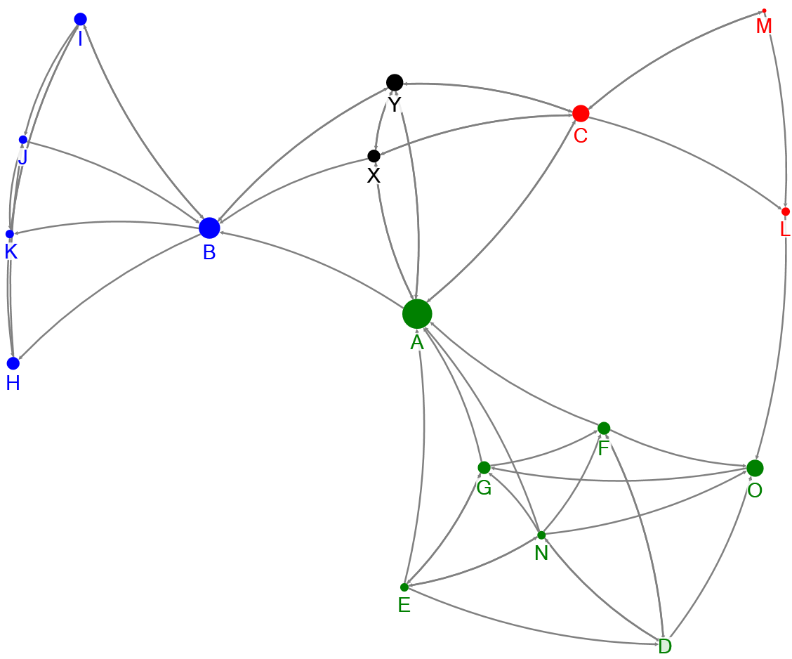
Figure 2: This is what a network diagram could look like if employees work in silos.
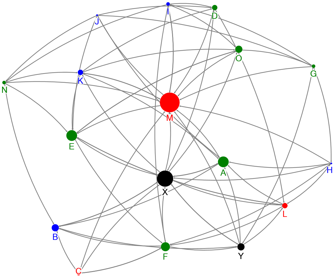
Figure 3: If the relations in this organization is much more networked, a network diagram could look like this.
The dots on the chart indicate employees. The colors indicate their organizational affiliation. The size of the dots shows how many relationships the employee has: the larger dot, the more relations. The lines are relationships. When employees work in silos (figure 2), most of the the team members only have relationships with each other and their manager. Two employees in this example relate across teams (O and L), and there is no direct relationship between chief executive Y and the employees. If Y and her managers wants greater cooperation between departments, there is work to do.
If the relationships in this organization is much more networked, a diagram could look like in figure 3. The first thing you notice is the round shape, and that there are two employees that are particularly central to the organization: X and M. None of them are leaders. Did Chief Executive Y and her middle managers know that? Maybe not.
What is an ONA and how does it work?
So, how is an ONA performed? An ONA consists of four phases. Let’s go through them one by one.
Data collection: What data is needed to draw an organizational network?
Overall, there are two types of data that can be used in an ONA: passive and active.
Passive data is data that already exists in your organization. It’s data from email systems, calendar bookings, skype chats, HR master data etc. The advantage in using passive data is that it is already there. It does not take extra effort to collect, it just needs to be pulled out. In addition, changes over time can be monitored continuously without having to re-collect.
But then again; only the information you already have in the systems are available. Relationships that do not take place through an IT system cannot be measured.You can see who’s participating in the same meetings, but not if they interact at the meetings. You can’t see who meets at the coffee machines or who’s having lunch with whom, and You don’t get insight into who speaks in the hallway.
There might also be a GDPR-issue in using this type of data. You as minimum should ensure that employees have given consent, before data is used for this purpose. Apart from the legal obligation, I would say that there is also an ethical challenge in using data coming from an internal and sometimes informal communication to analyze the network. You risk exposing relationships that the organization does not need to know of.
Active data is data collected through a questionnaire. Input will be a snapshot of the organization when data is collected, but in return you can ask quite accurately, and thus getting a clearer answer. The downside is that it will require a smaller take time from the employees. Questionnaires must be designed and sent out, and employees must be informed. The latter part is important, since the quality of the analysis is ultimately dependent on a high response rate and honest answers. So, an open communication with plenty opportunity to ask clarifying questions is essential.
When using active data, a GDPR compliant consent can be obtained as part of the questionnaire.
What to ask? The absolute simplest is to ask people to name the 5-10 people they work with on a daily basis. It provides the basic insight into the professional cooperation of the organization. You can also ask for who they go to for professional sparring, who gives energy and motivation, and who one uses to talk about a little more private things like hobbies, children, etc.
Whatever you choose, it is important to think through what you want out of the analysis, so that the questions are precisely formulated.
How many respondents can there be?
You should be a minimum of 12-15 people before it makes sense to do a network analysis. In principle, there is no upper limit, but the result varies according to size. From 15 to about 100 participants, you get a clear picture of each person’s role in the organization. If you are more than apr. 150, the overview becomes more general. You will be able to see overall trends and movements but should zoom in on single departments or areas if you need to have all the details.
Computing: How to draw the charts?
An organizational network will always have a three-dimensional form, since relationships often cross-section between people. Imagine 5 people who all relate equally to each other. If you imagine the network floating in the air it will look like a ball.
If it is to be drawn flat, it will look like this:
Five connected people. The colored dots are the people, and the lines between them are relationships.
The network diagrams are drawn with use of specialized software using a mathematical algorithm that calculates the best possible visual representation of the network. That is, the distance between two points is determined in relation to all the other points they are related to and the strength of the relationships.
Analysis and interpretation: What information do you get?
The primary information is the degree of groupings in the network, the density of the network and who are the largest influents.
The shape and any groupings provide information on the degree of silo formation. Do people work together across the organization or are they divided.
The density of the network reveals how many relationships there are, i.e. how well the organization is connected. The lines in the diagram (i.e. the relationships) can be compared with rubber bands. The more there are, the stronger they are pulled together.
The specific information given to you by an ONA depends of course on the questions asked, but if you focus on the professional and social network, you will be able to get information about how people work together and how much you talk together on a daily basis. Is everyone connected to everyone, or is each employee connected only to a few others? Depending on the type of tasks, a thinner network is not necessarily a bad thing. Highly introvert employees often thrive best with few, strong, relationships.
As mentioned above, silos and areas where people work together across departments or projects will be identified. Keep in mind that silos are not necessarily a bad thing, it always depends on the context.
You will be able to see influents i.e. people who have many relationships or play an important role in being a link between two areas. You will also gain insight into if there are employees who are potential bottlenecks and whether there are people that needs help to get more into the community. The influents, which typically have contact with large parts of the organization, could be associated with high value change projects.
What do you use the information for?
An organizational network diagram itself is just data. The value lies in the interpretation and subsequent action plans. For some, the ONA is a temperature measurement and a status on whether the organization is on the right track, for others a starting point and, help to identify change agents before a major cultural change or change project.
Want to know more?
Send me an email
and I’ll get back to you!
The world and your employees have changed.
Do you want to keep up
– and shape the future?
Do you want to make a deep dive?
Visit our learning paths with the
newest content – it’s all free!


